Information
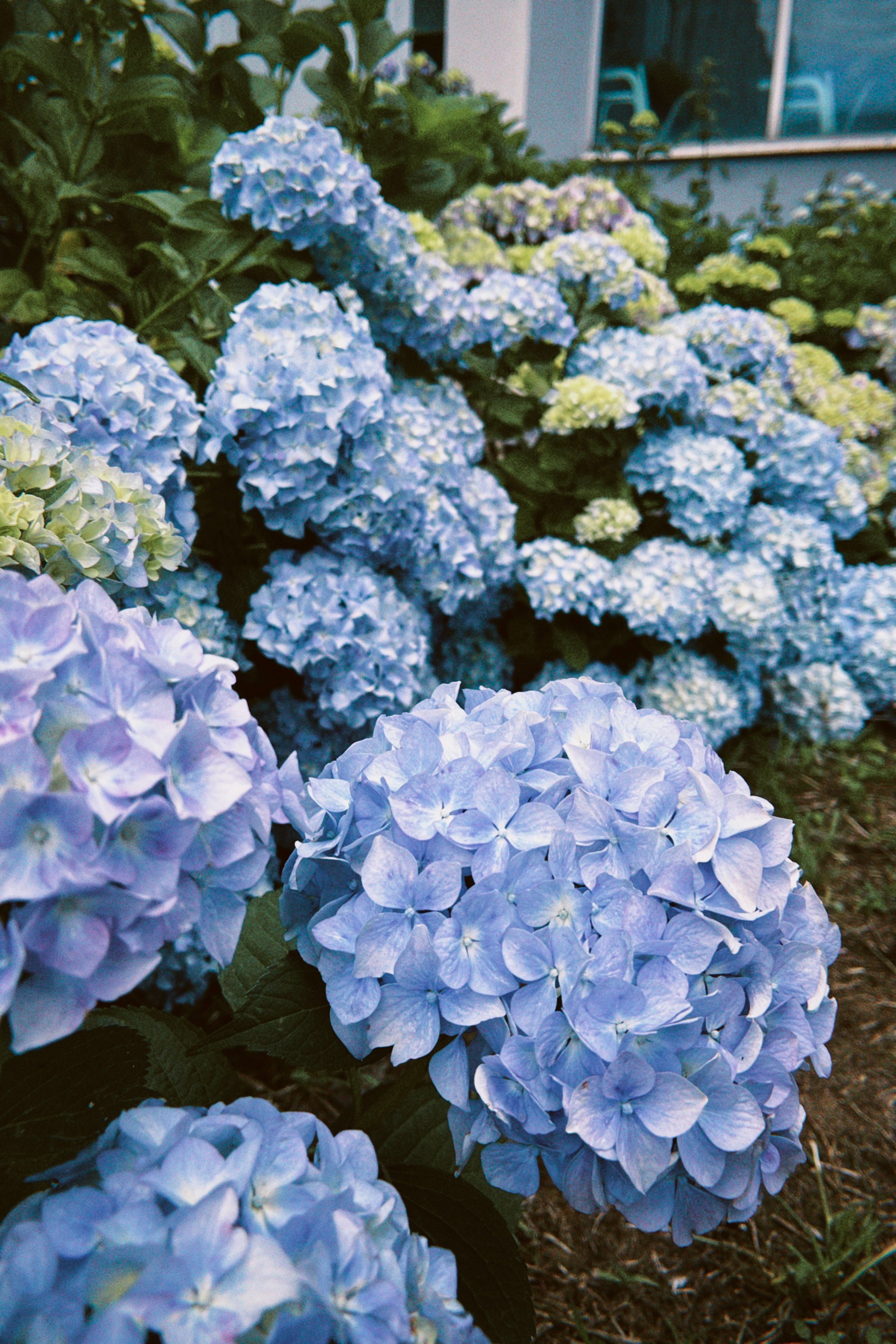
This section demonstrates a few techniques for responsive design:
- Grids - a structure that fluidly divides all children of the grid container into specified columns/rows
- This section uses a grid layout for screens 800px and larger, defined using grid-template-areas.
- The grid templating functionality allows easy customization of the layout: for instance, the header of the section at the top and the aside at the bottom can span all columns, while allowing the photo and paragraphs to fractionally take up different parts of the "row"
- On screens 992px and wider, the grid goes from a three column grid to a two column one so that the picture does not shrink too much on slightly smaller screens (e.g. tablet vs. computer).
-
Media Queries - a technique for responsive design. The device is "queried" to check the screen's width, and that information is used to conditionally
style the page.
- This section uses media queries to define a breakpoint at 800px; any smaller, and the grid isn't defined, which allows the image and text to stack on top of each other. This makes it easier to view the site on a mobile screen. Other formatting changes also occur, such as the navigation header stacking the links on top of each other and the margins/padding changing to accomodate a thinner screen.
- The section also has another breakpoint at 992px; for screen widths between 800px and 991px, the grid is defined with two columns, with photo and text taking up an equal part of the tow.
- Otherwise, with screens wider than 992px, the photo takes up a third of the row, and the text takes up two thirds.
Care Instructions

Using classes, this section follows the same formatting as the previous. The remaining text is for placeholder. Lorem ipsum dolor sit amet, consectetur adipisicing elit. Quaerat iure mollitia incidunt tenetur nulla tempore repellendus, tempora molestias omnis, modi quisquam repudiandae quae ea sunt illo ex consequatur, ipsam quo suscipit quasi rerum aliquam. Hic cupiditate atque corrupti explicabo quia quae soluta modi error accusantium voluptas fugit aliquid autem porro repellat enim recusandae unde blanditiis aliquam molestias, facere, dolores assumenda! Nobis, deleniti! Minima, officia quae! Ipsam exercitationem commodi aliquid ab nulla assumenda iste! Dignissimos, necessitatibus. Sequi at, aperiam esse quam minus placeat perspiciatis quia minima totam voluptatem maiores, a, pariatur expedita. Repellat molestias dolor voluptatem voluptas atque voluptatum veritatis incidunt.
Lorem ipsum dolor sit amet, consectetur adipisicing elit. Quaerat iure mollitia incidunt tenetur nulla tempore repellendus, tempora molestias omnis, modi quisquam repudiandae quae ea sunt illo ex consequatur, ipsam quo suscipit quasi rerum aliquam. Hic cupiditate atque corrupti explicabo quia quae soluta modi error accusantium voluptas fugit aliquid autem porro repellat enim recusandae unde blanditiis aliquam molestias, facere, dolores assumenda! Nobis, deleniti! Minima, officia quae! Ipsam exercitationem commodi aliquid ab nulla assumenda iste! Dignissimos, necessitatibus. Sequi at, aperiam esse quam minus placeat perspiciatis quia minima totam voluptatem maiores, a, pariatur expedita. Repellat molestias dolor voluptatem voluptas atque voluptatum veritatis incidunt.
Phylogeny
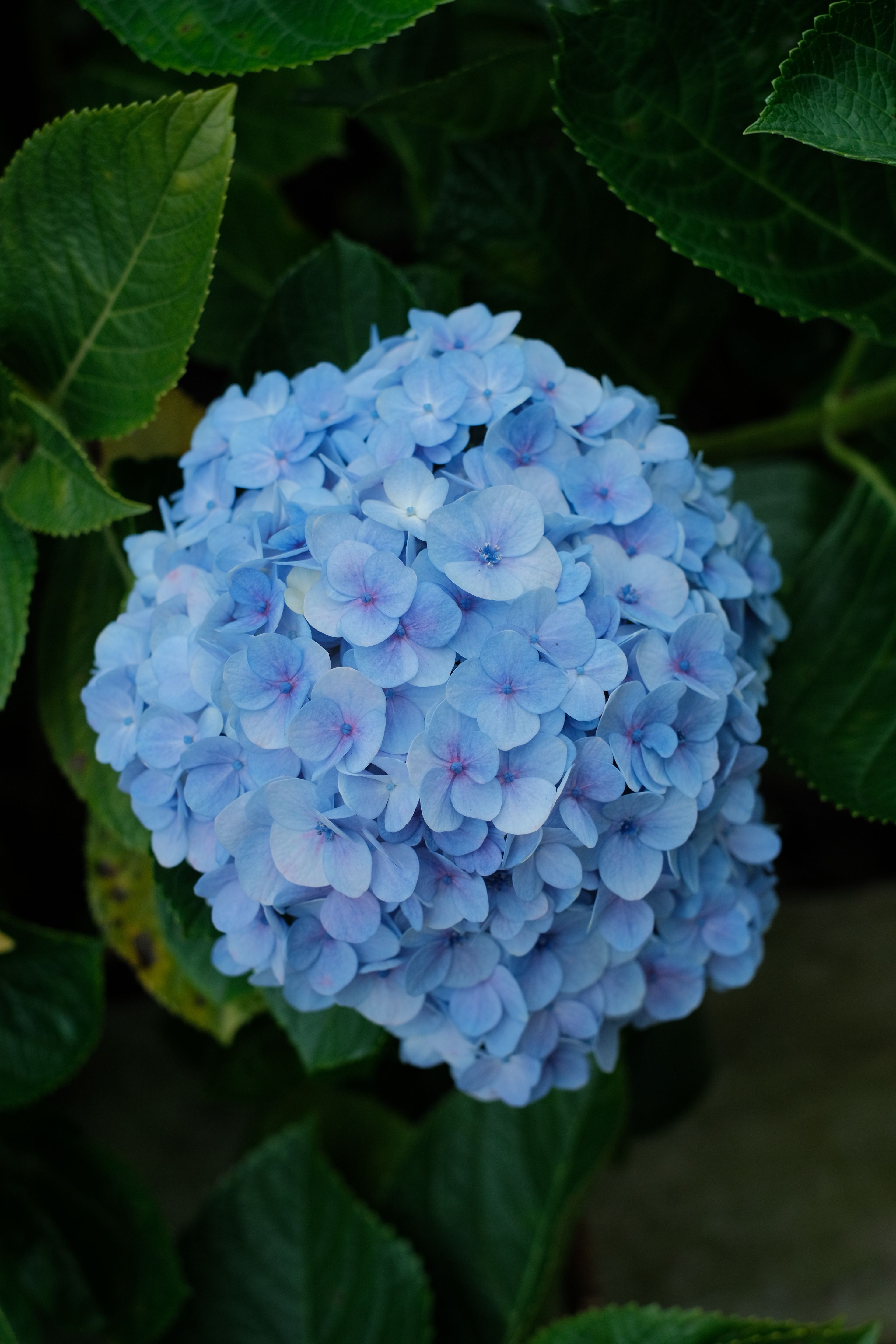
This image is floated on screens wider than 800px. On smaller devices, the image
instead is a "block" element that stacks on top of the text. Additionally, by setting the
max-width and max-height properties of the img
tag to 100% each, the image won't ever exceed the width/height of the container.
Lorem ipsum dolor sit amet, consectetur adipisicing elit. Quaerat iure mollitia incidunt tenetur nulla tempore repellendus, tempora molestias omnis, modi quisquam repudiandae quae ea sunt illo ex consequatur, ipsam quo suscipit quasi rerum aliquam. Hic cupiditate atque corrupti explicabo quia quae soluta modi error accusantium voluptas fugit aliquid autem porro repellat enim recusandae unde blanditiis aliquam molestias, facere, dolores assumenda! Nobis, deleniti! Minima, officia quae! Ipsam exercitationem commodi aliquid ab nulla assumenda iste! Dignissimos, necessitatibus. Sequi at, aperiam esse quam minus placeat perspiciatis quia minima totam voluptatem maiores, a, pariatur expedita. Repellat molestias dolor voluptatem voluptas atque voluptatum veritatis incidunt.
Lorem ipsum dolor sit amet, consectetur adipisicing elit. Quaerat iure mollitia incidunt tenetur nulla tempore repellendus, tempora molestias omnis, modi quisquam repudiandae quae ea sunt illo ex consequatur, ipsam quo suscipit quasi rerum aliquam. Hic cupiditate atque corrupti explicabo quia quae soluta modi error accusantium voluptas fugit aliquid autem porro repellat enim recusandae unde blanditiis aliquam molestias, facere, dolores assumenda! Nobis, deleniti! Minima, officia quae! Ipsam exercitationem commodi aliquid ab nulla assumenda iste! Dignissimos, necessitatibus. Sequi at, aperiam esse quam minus placeat perspiciatis quia minima totam voluptatem maiores, a, pariatur expedita. Repellat molestias dolor voluptatem voluptas atque voluptatum veritatis incidunt.