62M
Tons of E-Waste
Every year, humans toss out over 60 million metric tons of tech. It’s growing way faster than our actual recycling efforts can keep up with.
a student guide to understanding e-waste & sustainable tech
This page demonstrates responsive web design through CSS Grid, Flexbox, media queries, and fluid images. Resize the browser window to see the layouts adapt.
CSS Grid with repeat(auto-fit, minmax(250px, 1fr)). On desktop screens, these cards line up neatly side-by-side. As you resize your browser window, the grid automatically shifts the cards into fewer rows so nothing gets squished.
Every year, humans toss out over 60 million metric tons of tech. It’s growing way faster than our actual recycling efforts can keep up with.
Fewer than a quarter of old phones, laptops, and gadgets get safely recycled. The rest ends up sitting in landfills.
There's over $60 billion worth of copper, gold, and rare metals trapped inside thrown-away electronics each year.
Flexbox combined with a @media (max-width: 768px) query. On wide screens, the motherboard image and text sit side-by-side. Once the viewport screen gets smaller than 768px, the media query changes the flex direction to stack them vertically for mobile devices.

Photo by Alexandre Debiève on Unsplash
A lot of tech companies design products that are super hard to fix yourself, forcing us to buy new models every couple of years. The Right to Repair movement is pushing for companies to sell spare parts and share repair manuals with ordinary people.
If we can fix our own hardware or upgrade individual parts, we keep toxic materials out of the dirt and save money at the same time.
max-width: 100% and height: auto so they shrink down smoothly on smaller phone screens without overflowing past the screen edges.

Photo by Alfonso Navarro on Unsplash
Don't toss dead batteries or old phones in standard trash cans. Check for local e-waste recycling bins at city centers or tech stores.
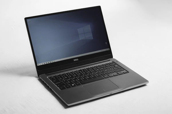
Photo by Kari Shea on Unsplash
If you have an old laptop or tablet that still turns on, consider wiping the hard drive and donating it to a local school or student group.